
Go back

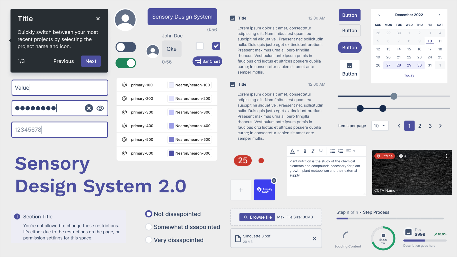
Sensory: building scalable Nearon’s design system
Involvement
Design systems
Brand designer
Product strategy
Platform
Mobile & Website
Product
Naeron
Year
2025
Problems
What I mention when I jump into the Nearon project is inconsistency. Although we have shared components from previous iteration when designing MVP and when designing our clients' projects, people keep detaching the component and creating new components in every iteration. That is not a real system, no single source of truth, no structure, no rules. This created a lot of design debt, slowed iteration, high development cost and made it difficult to maintain quality, especially as the team grew.
Design system audit
Since there are no senior designers here, and it's my first time developing a design system. So I do research about the best practice to build a design system and understand what we actually had with a comprehensive audit of the existing figma file - reviewing every component, mapping duplicates, tracing inconsistencies back to their source.I found that, the system has two fundamental problems - and they are related:

No single source of truth. We are just dumping components in shared storage. Components were created and modified independently, with no clear owner and no canonical version. When something changes, it changes in one place - and nowhere else.

No documentation, no structure, no rules, no guidelines. Without explicit guidance, design decisions relied on individual judgement. That's what makes them detach and create new components. That works fine when a team and project moves fast together. It breaks down when the team grows. When new people join, or when two designers work on the same product without syncing. The result is inconsistency that compounds over time.
Defining the concept
With the audit complete, I use a system-first approach grounded in Atomic Design principle. Why? After discussing and Interviewing with the Owner, PM, and business team, they have a vision to make the Nearon ecosystem to become scalable, multi-purpose and can be customized components for client solutions. Atomic design gave us a mental model that non-designers (engineers, PMs) could also understand and apply with agreed shared language.
The core idea was separation of concern defining clearly what each layer of the system was responsible for:
- Foundations - The foundations for customized building color, typography,
- Core Components - The atomic building blocks. Buttons, inputs, tags. Things that appear everywhere and must be absolutely consistent.
- Composite Components - Combinations of core components assembled for recurring patterns such as cards, modals, navigation bars.
- Product Specific implementations - where they can apply the system to their specific context, this comes when they need to explore new components for clients customization as long as they do not break defined rules.
This separation was the foundation of everything that came after, The hierarchy unify the language with other designers and prevent them from creating a pile of components.
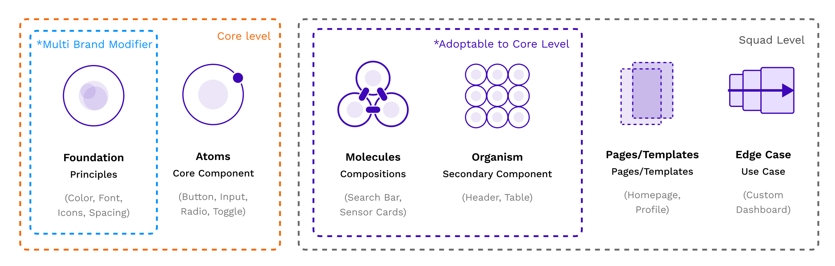
↑ Sensory Hierarchy
Component Classification & Prioritization
After auditing every file in our project, it ended with a ton of components. One of the most important decisions in this building design system is deciding what not to build first. Rather than attempting to systemize everything at once, I mapped every component against three criteria.
- Frequency - How often this appear across product
- Consistency Impact - How much visual debt does inconsistency here create?
- Scalability - What breaks if this is unstandardized?
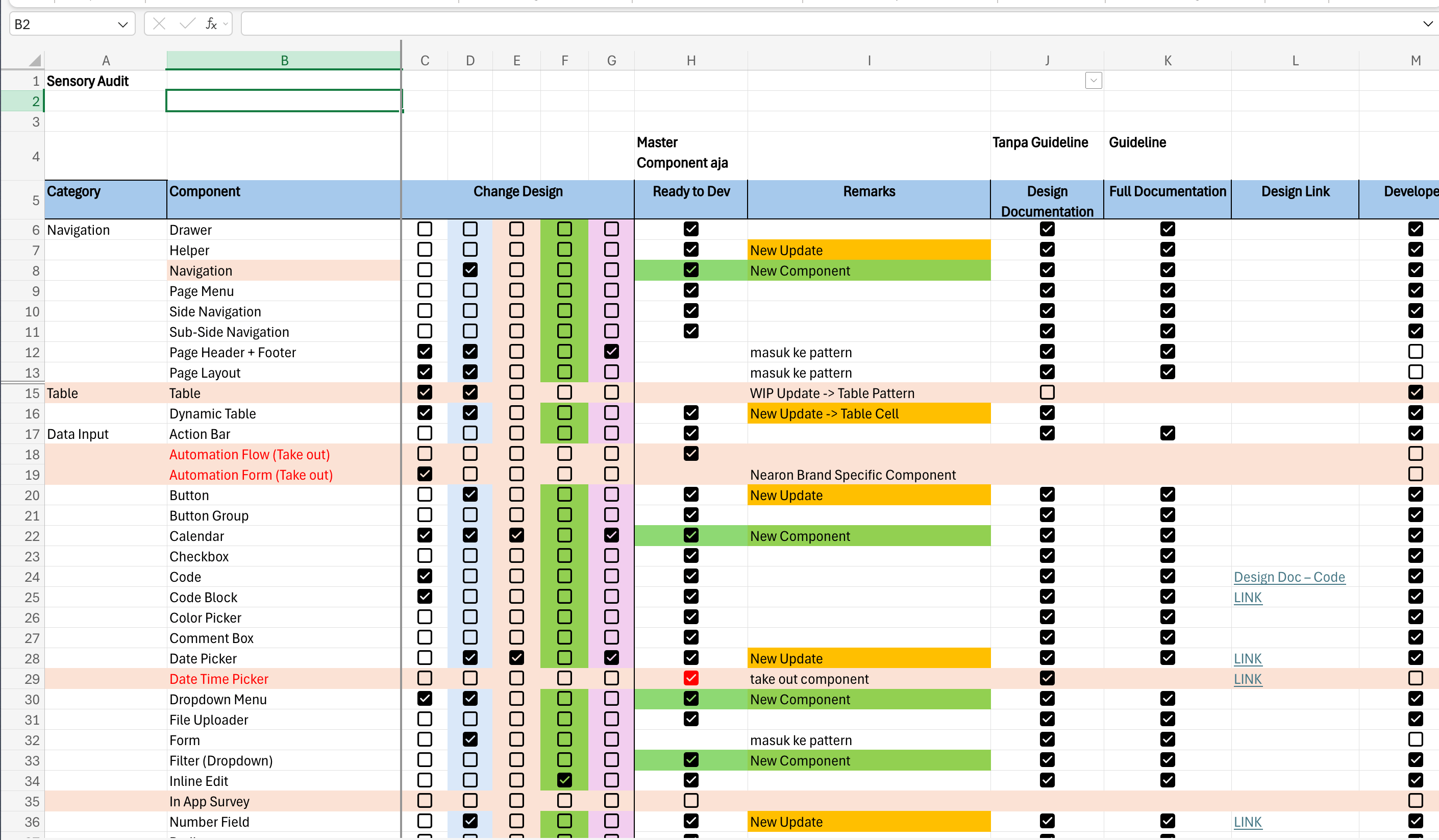
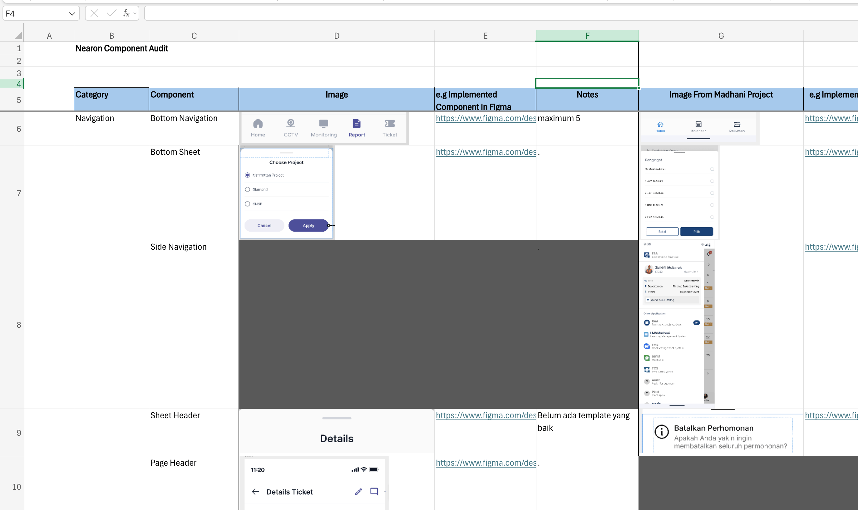
↑ Component list after auditing
The output wasn’t just a build order, it was about focusing limited time on components that created the most value for the teams since only one designer was doing this.
Defining the Rules and Documentation
Each component was built to the same standard - because consistency in how components are built is what makes a system trustworthy.
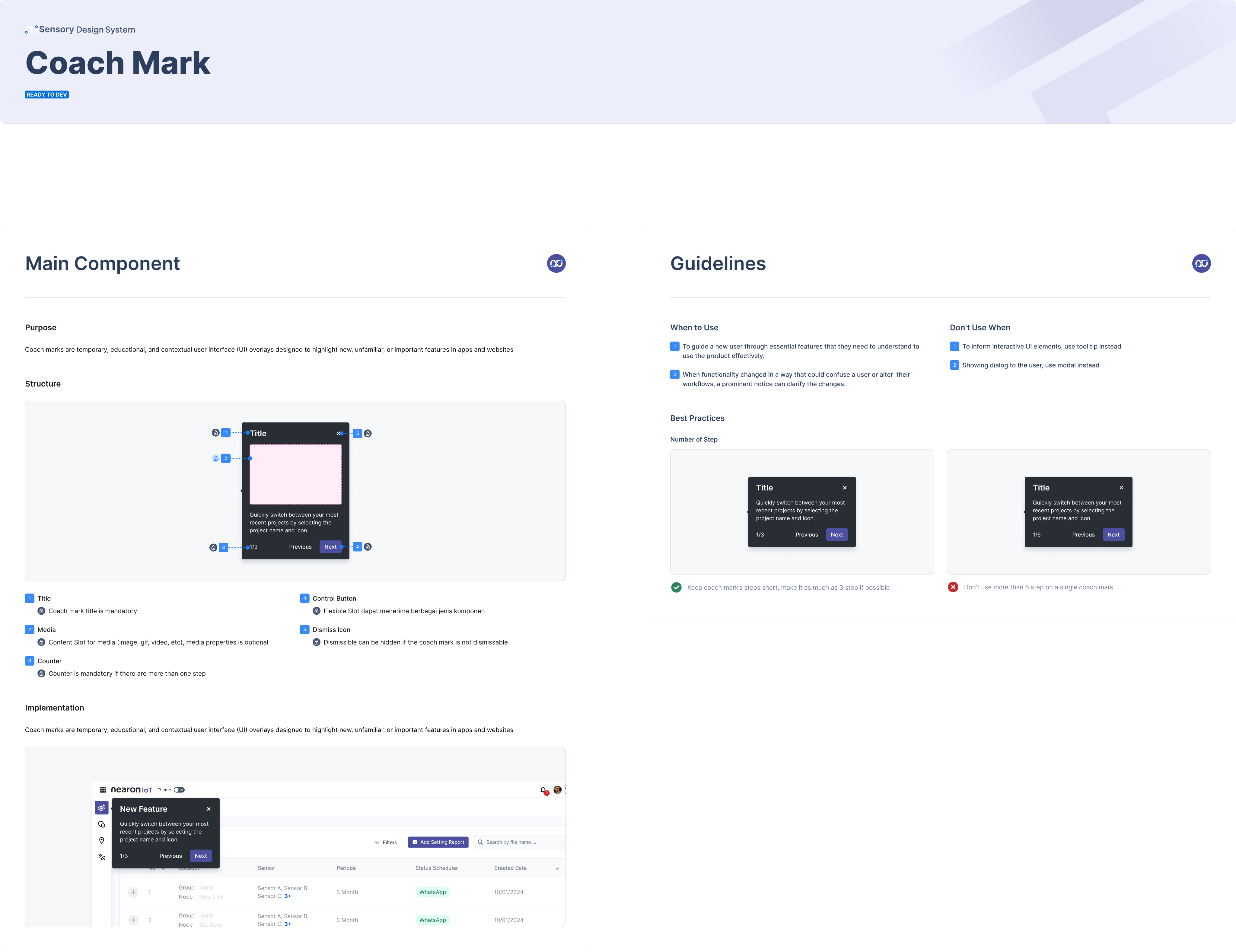
- Clear defined anatomy → Each component was broken down into explicit structural parts, clearly explaining the component container, the label, the icon slot, the state layer, and each part responsible for. This makes the component readable to anyone, not just the person who built it.
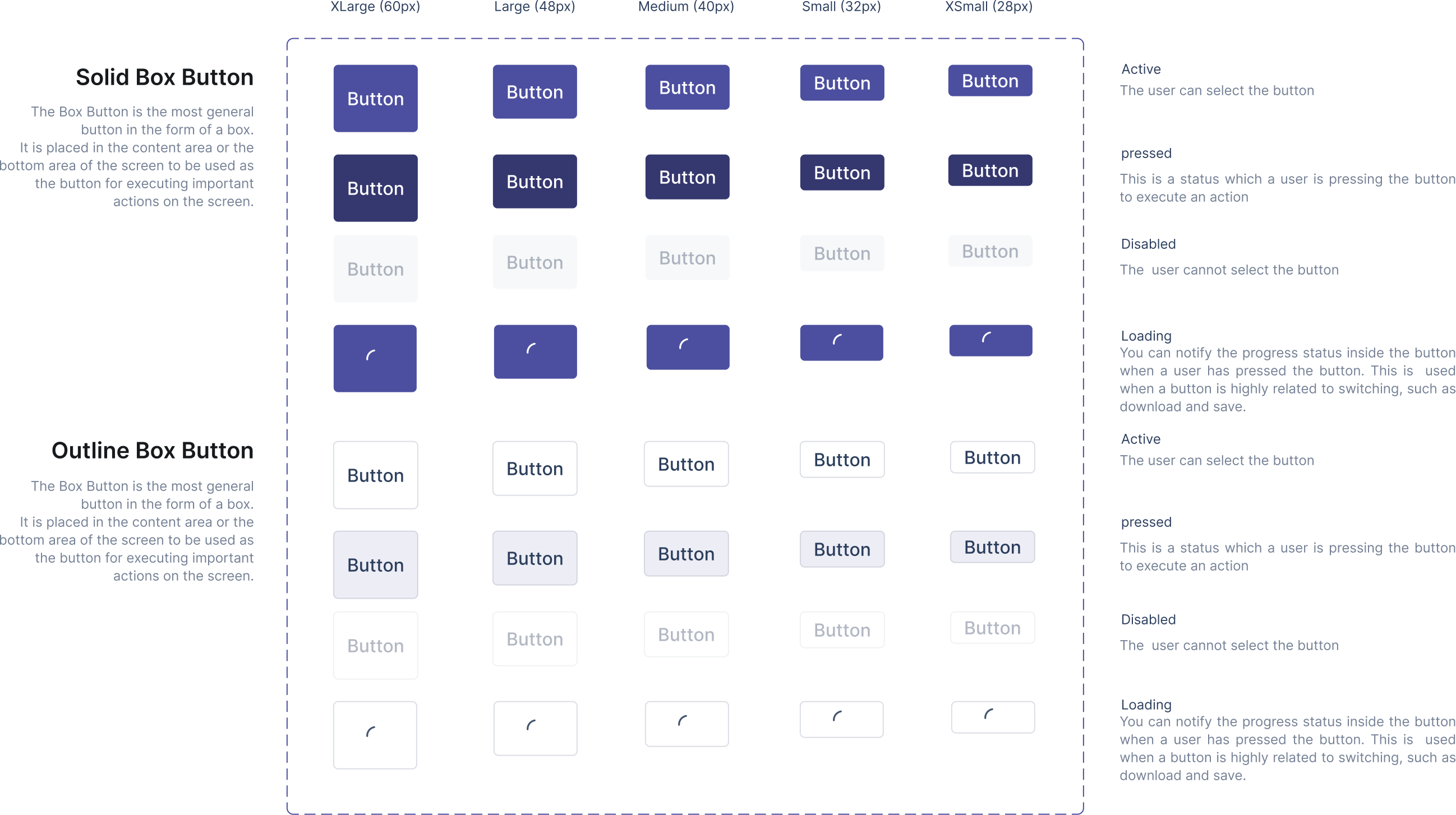
- Explicit Interaction states and behaviors → All states (default, hover, pressed, disabled, error, loading) are well defined and documented. Defining them upfront eliminates a whole category of back-and-forth.
- Scalable variant structures → Variants were organized systematically by size, emphasis and size so adding new variants in the future didn’t require restructuring the component. The system was designed to scale without accumulating complexity.
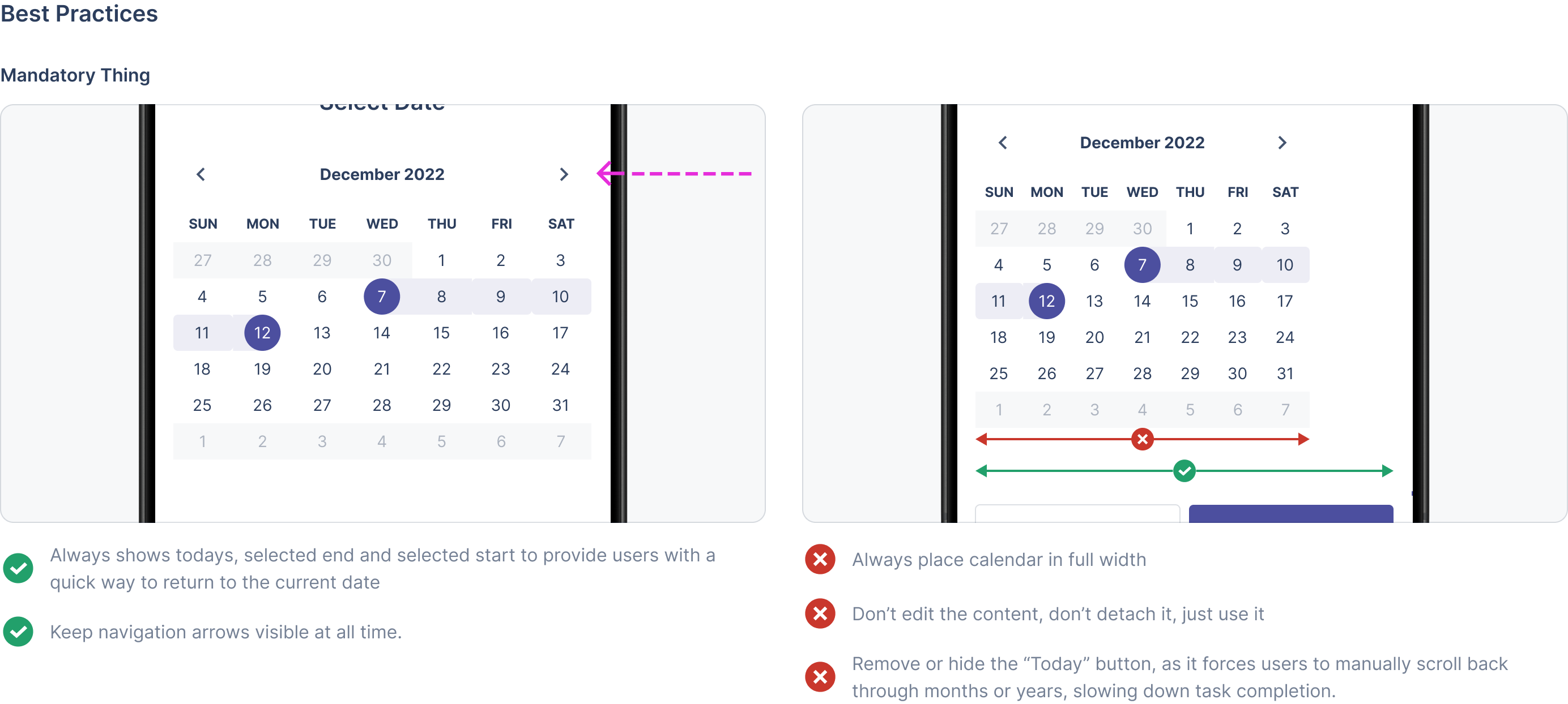
- Usage guideline, rules and constraints → Clear defined guidelines for each condition, the when and how each component should be used and shouldn’t. Clear documentation and guidelines helps to prevent unintentional misuse.

Impact
- For business → Faster design iteration and reduced time-to-market. Lower rework costs through standardized components. Improved product consistency - which strengthens brand trust. Reduced long-term maintenance overhead
- For the team → New designers can onboard and start contributing faster. With shared design language across teams - fewer alignment meetings, clearer handoffs, less time spent on decisions the system has already made. Design quality no longer depends on individual experience that is built into the foundation of the design team.
Key Takeaways
A design system is a product, not a file. It needs ownership, maintenance, and a way to measure its own success. Unfortunately we need to think realistically to make it at once since Synapsis doesn’t have a dedicated team to manage the design system, but a smaller system that teams actually use beats a comprehensive system that sits untouched. With commitment to build a lean, high-impact system first helps designers to maintain product consistency and the company doesn’t rely on individuals skills.
The moment the system worked wasn’t when the Figma file looked clean. It was when a designer joined the team, opened sensory, and knew exactly where to find what they needed – without asking anyone.
End
Go back
Dimas Mahendra
Product Designer based in 🇮🇩 Jakarta, Indonesia


Product Designer with 3+ years of experience designing high-scale product ecosystems through user empathy, discovery-led research, and AI-native design-to-code workflows.
PAST
- Founding UI/UX Designer @ Synapsis
- UI/UX Intern @ Ylabs Indonesia
CURRENT INTEREST
- AI tools and apps
- AI and Agentic Design
- Design engineer
Go back

Sensory: building scalable Nearon’s design system
Involvement
Design systems
Brand designer
Product strategy
Platform
Mobile & Website
Product
Naeron
Year
2025
Problems
What I mention when I jump into the Nearon project is inconsistency. Although we have shared components from previous iteration when designing MVP and when designing our clients' projects, people keep detaching the component and creating new components in every iteration. That is not a real system, no single source of truth, no structure, no rules. This created a lot of design debt, slowed iteration, high development cost and made it difficult to maintain quality, especially as the team grew.
Design system audit
Since there are no senior designers here, and it's my first time developing a design system. So I do research about the best practice to build a design system and understand what we actually had with a comprehensive audit of the existing figma file - reviewing every component, mapping duplicates, tracing inconsistencies back to their source.I found that, the system has two fundamental problems - and they are related:
No single source of truth. We are just dumping components in shared storage. Components were created and modified independently, with no clear owner and no canonical version. When something changes, it changes in one place - and nowhere else.
No documentation, no structure, no rules, no guidelines. Without explicit guidance, design decisions relied on individual judgement. That's what makes them detach and create new components. That works fine when a team and project moves fast together. It breaks down when the team grows. When new people join, or when two designers work on the same product without syncing. The result is inconsistency that compounds over time.
Defining the concept
With the audit complete, I use a system-first approach grounded in Atomic Design principle. Why? After discussing and Interviewing with the Owner, PM, and business team, they have a vision to make the Nearon ecosystem to become scalable, multi-purpose and can be customized components for client solutions. Atomic design gave us a mental model that non-designers (engineers, PMs) could also understand and apply with agreed shared language.
The core idea was separation of concern defining clearly what each layer of the system was responsible for:
- Foundations - The foundations for customized building color, typography,
- Core Components - The atomic building blocks. Buttons, inputs, tags. Things that appear everywhere and must be absolutely consistent.
- Composite Components - Combinations of core components assembled for recurring patterns such as cards, modals, navigation bars.
- Product Specific implementations - where they can apply the system to their specific context, this comes when they need to explore new components for clients customization as long as they do not break defined rules.
This separation was the foundation of everything that came after, The hierarchy unify the language with other designers and prevent them from creating a pile of components.
↑ Sensory Hierarchy
Component Classification & Prioritization
After auditing every file in our project, it ended with a ton of components. One of the most important decisions in this building design system is deciding what not to build first. Rather than attempting to systemize everything at once, I mapped every component against three criteria.
- Frequency - How often this appear across product
- Consistency Impact - How much visual debt does inconsistency here create?
- Scalability - What breaks if this is unstandardized?
↑ Component list after auditing
The output wasn’t just a build order, it was about focusing limited time on components that created the most value for the teams since only one designer was doing this.
Defining the Rules and Documentation
Each component was built to the same standard - because consistency in how components are built is what makes a system trustworthy.
- Clear defined anatomy → Each component was broken down into explicit structural parts, clearly explaining the component container, the label, the icon slot, the state layer, and each part responsible for. This makes the component readable to anyone, not just the person who built it.
- Explicit Interaction states and behaviors → All states (default, hover, pressed, disabled, error, loading) are well defined and documented. Defining them upfront eliminates a whole category of back-and-forth.
- Scalable variant structures → Variants were organized systematically by size, emphasis and size so adding new variants in the future didn’t require restructuring the component. The system was designed to scale without accumulating complexity.
- Usage guideline, rules and constraints → Clear defined guidelines for each condition, the when and how each component should be used and shouldn’t. Clear documentation and guidelines helps to prevent unintentional misuse.
Impact
- For business → Faster design iteration and reduced time-to-market. Lower rework costs through standardized components. Improved product consistency - which strengthens brand trust. Reduced long-term maintenance overhead
- For the team → New designers can onboard and start contributing faster. With shared design language across teams - fewer alignment meetings, clearer handoffs, less time spent on decisions the system has already made. Design quality no longer depends on individual experience that is built into the foundation of the design team.
Key Takeaways
A design system is a product, not a file. It needs ownership, maintenance, and a way to measure its own success. Unfortunately we need to think realistically to make it at once since Synapsis doesn’t have a dedicated team to manage the design system, but a smaller system that teams actually use beats a comprehensive system that sits untouched. With commitment to build a lean, high-impact system first helps designers to maintain product consistency and the company doesn’t rely on individuals skills.
The moment the system worked wasn’t when the Figma file looked clean. It was when a designer joined the team, opened sensory, and knew exactly where to find what they needed – without asking anyone.
End
Go back
Dimas Mahendra
Product Designer based in 🇮🇩 Jakarta, Indonesia
Product Designer with 3+ years of experience designing high-scale product ecosystems through user empathy, discovery-led research, and AI-native design-to-code workflows.
PAST
- Founding UI/UX Designer @ Synapsis
- UI/UX Intern @ Ylabs Indonesia
CURRENT INTEREST
- AI tools and apps
- AI and Agentic Design
- Design engineer
Go back

Sensory: building scalable Nearon’s design system
Involvement
Design systems
Brand designer
Product strategy
Platform
Mobile & Website
Product
Naeron
Year
2025
Problems
What I mention when I jump into the Nearon project is inconsistency. Although we have shared components from previous iteration when designing MVP and when designing our clients' projects, people keep detaching the component and creating new components in every iteration. That is not a real system, no single source of truth, no structure, no rules. This created a lot of design debt, slowed iteration, high development cost and made it difficult to maintain quality, especially as the team grew.
Design system audit
Since there are no senior designers here, and it's my first time developing a design system. So I do research about the best practice to build a design system and understand what we actually had with a comprehensive audit of the existing figma file - reviewing every component, mapping duplicates, tracing inconsistencies back to their source.I found that, the system has two fundamental problems - and they are related:
No single source of truth. We are just dumping components in shared storage. Components were created and modified independently, with no clear owner and no canonical version. When something changes, it changes in one place - and nowhere else.
No documentation, no structure, no rules, no guidelines. Without explicit guidance, design decisions relied on individual judgement. That's what makes them detach and create new components. That works fine when a team and project moves fast together. It breaks down when the team grows. When new people join, or when two designers work on the same product without syncing. The result is inconsistency that compounds over time.
Defining the concept
With the audit complete, I use a system-first approach grounded in Atomic Design principle. Why? After discussing and Interviewing with the Owner, PM, and business team, they have a vision to make the Nearon ecosystem to become scalable, multi-purpose and can be customized components for client solutions. Atomic design gave us a mental model that non-designers (engineers, PMs) could also understand and apply with agreed shared language.
The core idea was separation of concern defining clearly what each layer of the system was responsible for:
- Foundations - The foundations for customized building color, typography,
- Core Components - The atomic building blocks. Buttons, inputs, tags. Things that appear everywhere and must be absolutely consistent.
- Composite Components - Combinations of core components assembled for recurring patterns such as cards, modals, navigation bars.
- Product Specific implementations - where they can apply the system to their specific context, this comes when they need to explore new components for clients customization as long as they do not break defined rules.
This separation was the foundation of everything that came after, The hierarchy unify the language with other designers and prevent them from creating a pile of components.
↑ Sensory Hierarchy
Component Classification & Prioritization
After auditing every file in our project, it ended with a ton of components. One of the most important decisions in this building design system is deciding what not to build first. Rather than attempting to systemize everything at once, I mapped every component against three criteria.
- Frequency - How often this appear across product
- Consistency Impact - How much visual debt does inconsistency here create?
- Scalability - What breaks if this is unstandardized?
↑ Component list after auditing
The output wasn’t just a build order, it was about focusing limited time on components that created the most value for the teams since only one designer was doing this.
Defining the Rules and Documentation
Each component was built to the same standard - because consistency in how components are built is what makes a system trustworthy.
- Clear defined anatomy → Each component was broken down into explicit structural parts, clearly explaining the component container, the label, the icon slot, the state layer, and each part responsible for. This makes the component readable to anyone, not just the person who built it.
- Explicit Interaction states and behaviors → All states (default, hover, pressed, disabled, error, loading) are well defined and documented. Defining them upfront eliminates a whole category of back-and-forth.
- Scalable variant structures → Variants were organized systematically by size, emphasis and size so adding new variants in the future didn’t require restructuring the component. The system was designed to scale without accumulating complexity.
- Usage guideline, rules and constraints → Clear defined guidelines for each condition, the when and how each component should be used and shouldn’t. Clear documentation and guidelines helps to prevent unintentional misuse.
Impact
- For business → Faster design iteration and reduced time-to-market. Lower rework costs through standardized components. Improved product consistency - which strengthens brand trust. Reduced long-term maintenance overhead
- For the team → New designers can onboard and start contributing faster. With shared design language across teams - fewer alignment meetings, clearer handoffs, less time spent on decisions the system has already made. Design quality no longer depends on individual experience that is built into the foundation of the design team.
Key Takeaways
A design system is a product, not a file. It needs ownership, maintenance, and a way to measure its own success. Unfortunately we need to think realistically to make it at once since Synapsis doesn’t have a dedicated team to manage the design system, but a smaller system that teams actually use beats a comprehensive system that sits untouched. With commitment to build a lean, high-impact system first helps designers to maintain product consistency and the company doesn’t rely on individuals skills.
The moment the system worked wasn’t when the Figma file looked clean. It was when a designer joined the team, opened sensory, and knew exactly where to find what they needed – without asking anyone.
End
Go back